For those of you who’ve ever felt that queasy feeling when it comes to writing a sales page, let me reassure you: authentic marketing is the key to making the process feel right, both for you and your audience. Creating a sales page shouldn’t feel like you’re pushing someone into buying something they don’t need. It should be about genuinely connecting with your audience and showing them how what you offer solves a real problem in their lives.
Let’s dive into how to build and write a great sales page that is not only effective but rooted in authenticity.

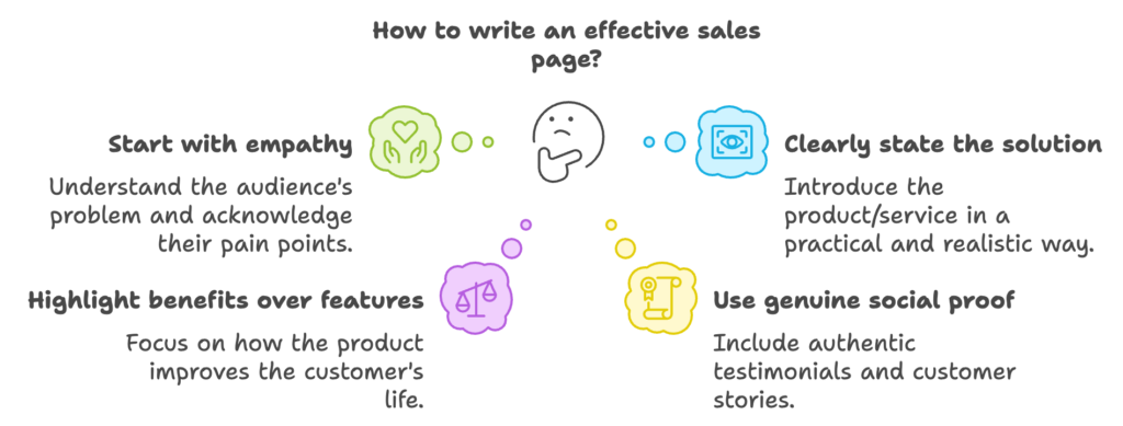
1. Start with empathy – Understand their problem
The foundation of a great sales page is understanding your audience’s problem. Before you start writing, take time to truly connect with what your audience is struggling with. Imagine their day-to-day frustrations and challenges. For example, if you’re offering a productivity tool, think about the stress and overwhelm they feel when they’re juggling tasks and missing deadlines.
Open your sales page by acknowledging their pain point. Don’t jump straight into your product or solution. Show them you get it.
A sentence like: “Does your to-do list keep growing while your time feels like it’s slipping away? If you’re tired of feeling overwhelmed and stuck in constant catch-up mode, you’re not alone.”
By starting with empathy, your audience feels seen and understood. Authentic marketing is about building relationships, not just making a sale.
2. Clearly state your solution without the fluff
Once you’ve connected with their problem, it’s time to introduce your solution. But here’s where authenticity comes in: keep it real and simple. You don’t need to promise that your product is going to “change their life forever” or “be the only solution they’ll ever need.”
Instead, explain how your product or service solves the problem in a practical, realistic way. People appreciate honesty and transparency. You’re not selling magic; you’re offering something that works.
For example: “Our productivity tool helps you streamline your tasks, prioritize effectively, and finally reclaim control of your time.”
Notice how this is direct and practical, but without the over-the-top claims. You want to strike a balance between excitement and realism – they should believe in your product’s potential, but not feel like it’s an unrealistic promise.
3. Highlight benefits over features (but be honest)
Now, let’s talk about benefits vs. features. Features are what your product does; benefits are what those features do for your customer. Focus on how your product will improve their life.
Here’s where many sales pages get it wrong: they throw a list of features at the reader without making it clear why those features matter.
Instead of just listing out features like:
- “Task management”
- “Priority labels”
- “Reminders and deadlines”
Try reframing them as benefits, like: “With our task management system, you’ll stay organized without effort. Priority labels ensure that you never waste time on low-value tasks, and reminders keep you on track, so nothing slips through the cracks.”
It’s the benefit that makes the feature worth mentioning – that’s the part that resonates with your audience.
4. Use social proof, but keep it genuine
One of the most powerful tools you can use on a sales page is social proof. Testimonials, case studies, and customer stories help potential buyers see that others, just like them, have already benefited from what you’re offering. But there’s a catch: your social proof needs to feel real.
If your testimonials feel overly polished or scripted, people will smell it a mile away. Use authentic, specific testimonials that reflect real experiences.
For example: “Before using this tool, I felt like I was constantly behind. Now, I finally feel on top of things, and my stress has dropped dramatically.” – Anna S., freelancer
Testimonials like this speak directly to the experience your product provides, without sounding too polished. Make sure they reflect the journey your customers went through – from struggle to solution.
5. Keep the copy conversational and cuman
Here’s where your tone of voice makes a huge difference. A great sales page doesn’t sound like a corporate pitch. It should sound like a conversation. Imagine you’re explaining your product to a friend who needs help, not trying to hit them with a rehearsed sales script.
Use conversational language that’s easy to understand, and avoid buzzwords or jargon that might confuse your audience. The goal is for your reader to feel like they’re chatting with someone who genuinely wants to help them, not just make a quick sale.
An example might be: “We know what it’s like to feel overwhelmed by a growing to-do list. That’s why we built this tool – to help people just like you take control of their time and get more done, without the stress.”
Simple, clear, and human.
6. Show, don’t just tell
You’ve highlighted the benefits and features, but now it’s time to show them in action. Use screenshots, demos, or explainer videos to show exactly how your product works and how it can solve their problem.
People want to see proof that what you’re offering actually does what you say it will. And visuals or demonstrations add credibility and clarity.
For example, if your product is an app, include a video demo where potential customers can see the interface and how it helps manage tasks more efficiently. This visual proof is worth more than a hundred words.
7. Create a clear and compelling call to action (CTA)
Finally, your sales page needs to end with a clear and compelling call to action. After reading through the benefits, testimonials, and seeing how your product works, the reader needs to know what to do next – without confusion.
Your CTA should be specific and inviting, but not pushy. Think of it as an invitation rather than a demand. Make sure it clearly reflects the value they’re going to get by clicking that button.
For example: “Ready to take control of your time? Start your free trial today and see the difference.”
This CTA is inviting them to experience the solution for themselves, without making them feel pressured.
Conclusion: Authenticity wins every time
The most effective sales pages are the ones that feel genuine, helpful, and authentic. People aren’t looking for flashy, exaggerated claims – they’re looking for real solutions to their problems, and they want to feel confident that they can trust you.
By focusing on understanding your audience’s needs, clearly presenting your solution, and writing in a human, relatable tone, you’ll create a sales page that not only converts but builds trust with your audience.
Remember, it’s not about pushing a sale – it’s about helping someone find the right solution. And when you approach it from that angle, your sales page becomes something much more valuable.

